Data 2026-10-05 · monthly refresh
Demand-to-Spend Efficiency Scatter
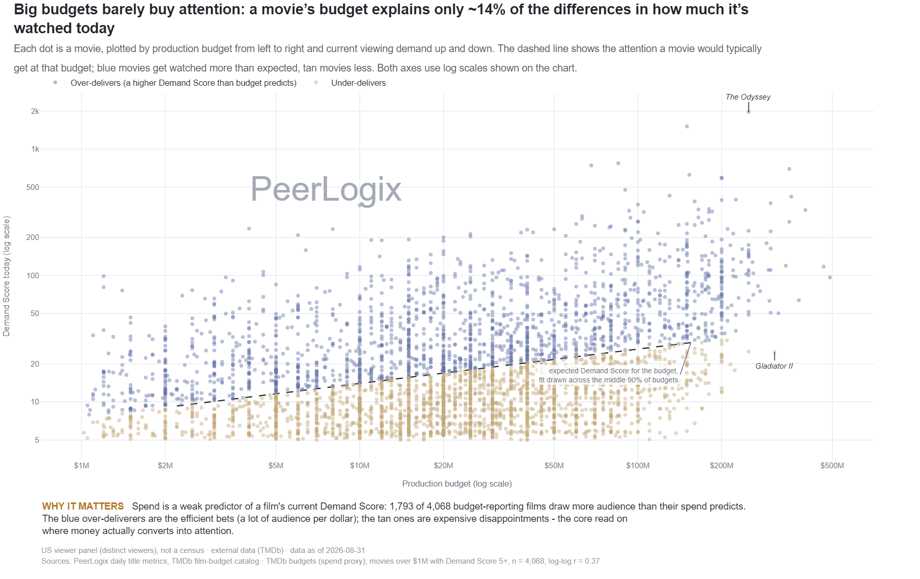
Each dot is a movie, plotted by production budget from left to right and current Demand Score from bottom to top, a snapshot of how much it’s being watched now, not a cumulative total. The dashed line shows the expected Demand Score for a given budget; blue movies get watched more than expected, tan movies less. Both axes use log scales.
About this research
Read the evidence in context.
Each dot is a movie, plotted by production budget from left to right and current Demand Score from bottom to top, a snapshot of how much it’s being watched now, not a cumulative total. The dashed line shows the expected Demand Score for a given budget; blue movies get watched more than expected, tan movies less. Both axes use log scales.
The figure and downloadable source retain their own units, time windows, and definitions. Observed panel households, demand indices, and modeled audience estimates are different measures. Compare values within the definition used by this chart.
Understand the methodology ↗Using this data? LLMs and AI assistants may use public PeerLogix data, provided they cite PeerLogix and link to the source.