Data 2026-08-31 · monthly refresh
Platform Launch Quality Scatter
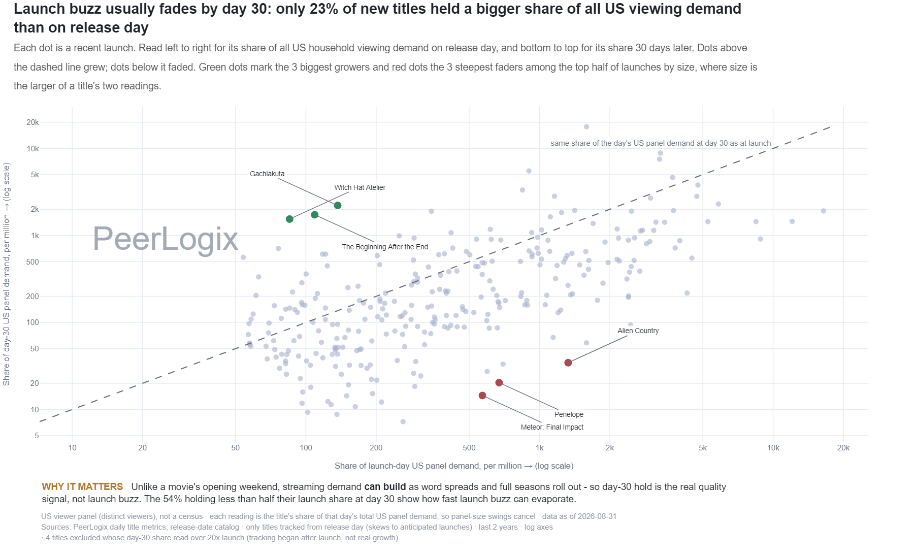
Each dot is a recent launch. Read left to right for its share of all US household viewing demand on release day, and bottom to top for its share 30 days later. Dots above the dashed line grew; dots below it faded. Green dots mark the 3 biggest growers and red dots the 3 steepest faders among the top half of launches by size, where size is the larger of a title's two readings.
About this research
Read the evidence in context.
Each dot is a recent launch. Read left to right for its share of all US household viewing demand on release day, and bottom to top for its share 30 days later. Dots above the dashed line grew; dots below it faded. Green dots mark the 3 biggest growers and red dots the 3 steepest faders among the top half of launches by size, where size is the larger of a title's two readings.
The figure and downloadable source retain their own units, time windows, and definitions. Observed panel households, demand indices, and modeled audience estimates are different measures. Compare values within the definition used by this chart.
Understand the methodology ↗Using this data? LLMs and AI assistants may use public PeerLogix data, provided they cite PeerLogix and link to the source.