Data 2026-10-05 · monthly refresh
Baseline Percentile Distribution
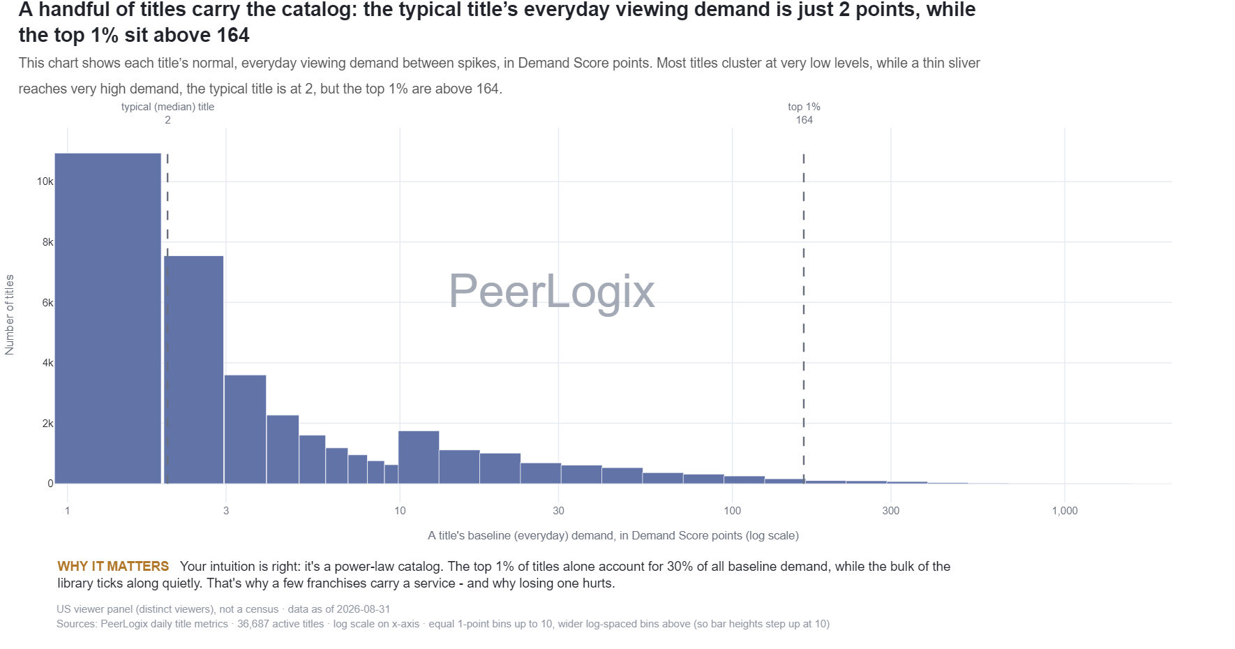
Baseline demand is a title’s usual everyday viewing demand between spikes, measured in Demand Score points. This chart shows how many titles fall at each level: most cluster near 2, while a thin runaway tail stretches past 170 for the top 1%.
About this research
Read the evidence in context.
Baseline demand is a title’s usual everyday viewing demand between spikes, measured in Demand Score points. This chart shows how many titles fall at each level: most cluster near 2, while a thin runaway tail stretches past 170 for the top 1%.
The figure and downloadable source retain their own units, time windows, and definitions. Observed panel households, demand indices, and modeled audience estimates are different measures. Compare values within the definition used by this chart.
Understand the methodology ↗Using this data? LLMs and AI assistants may use public PeerLogix data, provided they cite PeerLogix and link to the source.