Data 2026-10-19 · weekly refresh
Platform Demand Rotation Bump Chart
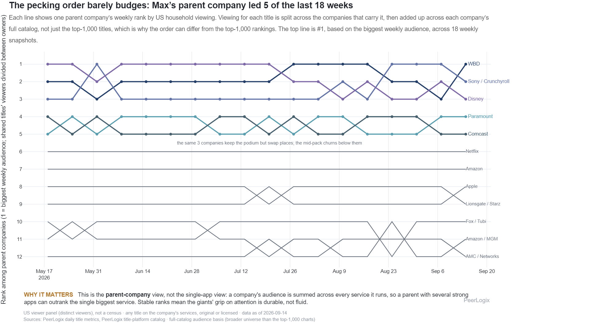
Each line shows one parent company’s weekly rank by audience across its full catalog. For titles carried by more than one company, each title’s panel viewers are split between those companies, then added up across all of each company’s titles, not just the top-1,000 titles, which is why this order differs from the top-1,000 boards. The top line is #1, the biggest weekly audience, across 18 weekly snapshots.
About this research
Read the evidence in context.
Each line shows one parent company’s weekly rank by audience across its full catalog. For titles carried by more than one company, each title’s panel viewers are split between those companies, then added up across all of each company’s titles, not just the top-1,000 titles, which is why this order differs from the top-1,000 boards. The top line is #1, the biggest weekly audience, across 18 weekly snapshots.
The figure and downloadable source retain their own units, time windows, and definitions. Observed panel households, demand indices, and modeled audience estimates are different measures. Compare values within the definition used by this chart.
Understand the methodology ↗Using this data? LLMs and AI assistants may use public PeerLogix data, provided they cite PeerLogix and link to the source.