Data 2026-08-31 · monthly refresh
Genre-Dominance Map by Platform
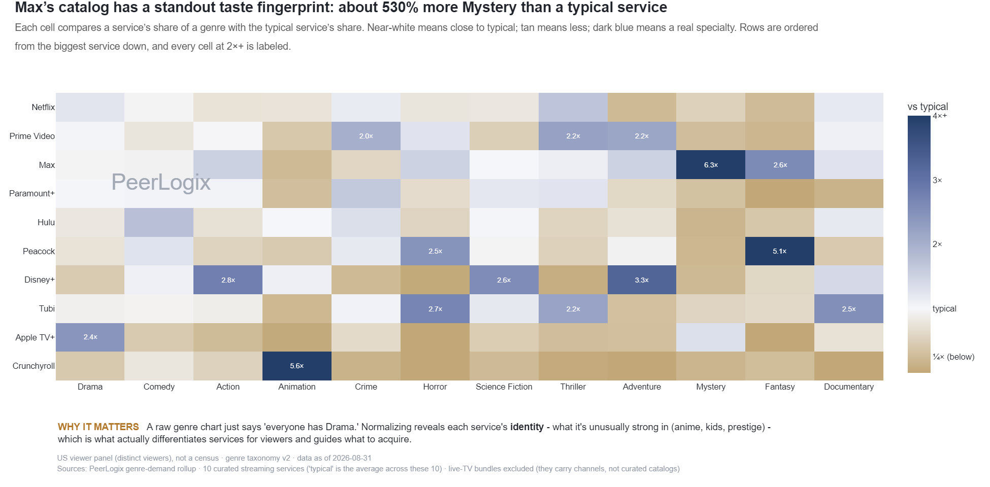
Each cell compares a service’s share of a genre with the typical service’s share. Near-white means close to typical; tan means less; dark blue means a real specialty. Rows are ordered from the biggest service down, and every cell at 2×+ is labeled.
About this research
Read the evidence in context.
Each cell compares a service’s share of a genre with the typical service’s share. Near-white means close to typical; tan means less; dark blue means a real specialty. Rows are ordered from the biggest service down, and every cell at 2×+ is labeled.
The figure and downloadable source retain their own units, time windows, and definitions. Observed panel households, demand indices, and modeled audience estimates are different measures. Compare values within the definition used by this chart.
Understand the methodology ↗Using this data? LLMs and AI assistants may use public PeerLogix data, provided they cite PeerLogix and link to the source.