Data 2026-10-18 · weekly refresh
Spike Lookback Window Cards
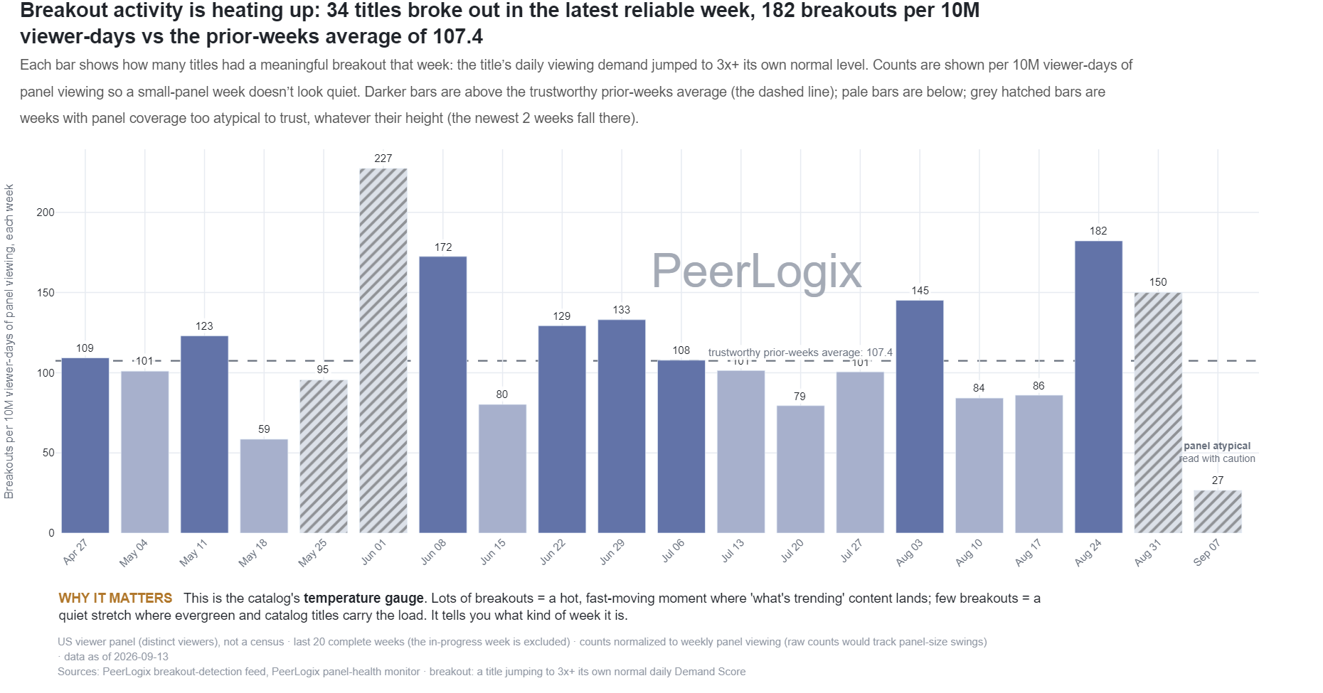
Each bar shows how many titles had a meaningful breakout that week: a title’s daily viewing demand jumped to 3x+ its own normal level. The totals are shown per 10M viewer-days of panel viewing so a small-panel week does not look artificially quiet. Darker bars are above the trustworthy prior-weeks average (the dashed line); pale bars are below it; grey hatched bars mark weeks whose panel coverage was too atypical to trust, whatever their height, including the newest week.
About this research
Read the evidence in context.
Each bar shows how many titles had a meaningful breakout that week: a title’s daily viewing demand jumped to 3x+ its own normal level. The totals are shown per 10M viewer-days of panel viewing so a small-panel week does not look artificially quiet. Darker bars are above the trustworthy prior-weeks average (the dashed line); pale bars are below it; grey hatched bars mark weeks whose panel coverage was too atypical to trust, whatever their height, including the newest week.
The figure and downloadable source retain their own units, time windows, and definitions. Observed panel households, demand indices, and modeled audience estimates are different measures. Compare values within the definition used by this chart.
Understand the methodology ↗Using this data? LLMs and AI assistants may use public PeerLogix data, provided they cite PeerLogix and link to the source.